March 7, 2024By Noisy Raven
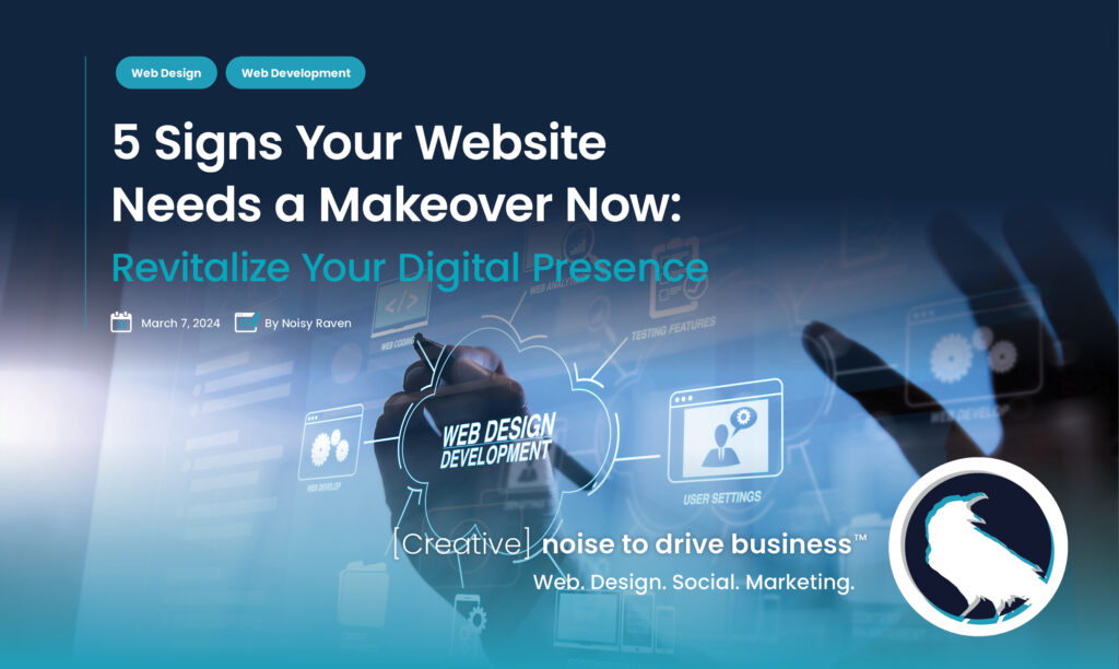
5 Signs Your Website Needs a Makeover Now
No products in the cart.
Launching a new website is a pivotal moment for any business, marking the culmination of hard work, planning, and development. Covering all bases and leaving nothing to chance is crucial to ensure a successful launch. This comprehensive checklist guides you through the essential steps for launching your new website, ensuring it’s optimized for performance, security, and user experience.
Launching a new website is a significant milestone, but the work continues beyond that. This ultimate checklist ensures a smooth launch and sets the foundation for ongoing optimization and success. Regular maintenance, updates, and engagement with your audience are vital to keeping your website relevant and effective.
If the tasks involved in launching a new website seem overwhelming, Noisy Raven’s Web Design & Development services are here to assist. Our expertise ensures your website launch is seamless, from the initial planning stages to post-launch support. Let us help you unveil a website that exceeds expectations and drives your business forward.
Ready to launch your website with confidence? Contact Noisy Raven today, and let’s make your website launch successful.
In the digital age, your website is often the first point of contact between your brand and potential customers. A positive user experience (UX) is crucial in converting visitors into customers and ensuring they return. Improving UX involves understanding how users interact with your website and making their journey as smooth and enjoyable as possible. Here are five actionable steps to enhance the UX of your website.
Straightforward and intuitive navigation is the cornerstone of a positive UX. Users should find what they’re looking for in just a few clicks. To achieve this:
Website speed is a critical component of UX. Slow-loading pages frustrate users and often lead to high bounce rates. To improve your site’s speed:
With the increasing prevalence of mobile browsing, your website must perform flawlessly across all devices. A responsive design automatically adjusts to fit the screen it’s viewed on, providing a seamless experience for mobile and tablet users. Test your website on various devices and browsers to ensure compatibility and responsiveness.
Content is a significant part of UX, guiding users through your website and encouraging them to take action. To enhance UX through content:
Continuous improvement is vital to outstanding UX. Collect user feedback through surveys, feedback forms, and usability tests. Pay attention to common issues or suggestions and make necessary adjustments. Implementing user feedback demonstrates that you value their input and are committed to providing the best experience possible.
Improving your website’s UX is an ongoing process that can significantly impact your business’s success. You can create a website that meets and exceeds user expectations by simplifying navigation, speeding up your site, ensuring mobile responsiveness, using clear and engaging content, and gathering and implementing feedback.
If you want to elevate your website’s UX but need help figuring out where to start, Noisy Raven’s Web Design and Development services are here to help. Our team of experts specializes in creating websites that are visually stunning and optimized for the best user experience. Contact us today to learn how we can transform your website into a powerful tool for your business’s success.
In today’s fast-paced digital landscape, where the line between the online and offline worlds is increasingly blurred, having a responsive website is no longer a luxury—it’s a necessity. Responsive web design allows your website to adapt seamlessly to any screen size, ensuring a flawless user experience across all devices, from desktops to smartphones. Here’s why your business needs to prioritize responsiveness in its web design strategy more than ever.
With over half of global internet traffic coming from mobile devices, the shift towards mobile-first browsing is undeniable. Consumers expect to access information, shop, and interact with brands conveniently on their smartphones. Suppose your website isn’t optimized for mobile. In that case, you’re not only missing out on a significant portion of potential traffic but also risking high bounce rates as users leave in frustration over poor navigation and slow loading times.
A responsive website provides a smooth, cohesive experience for users, regardless of their device. This adaptability is crucial for keeping potential customers engaged and interested in your content. Users are more likely to stay longer, explore more pages, and ultimately convert into customers or followers when they encounter a website that looks great and functions well on their device.
Search engines like Google have made it clear that responsiveness is a key factor in their ranking algorithms. A mobile-friendly website is more likely to rank higher in search results, making it easier for potential customers to find you. By prioritizing responsive design, you’re enhancing user experience and boosting your SEO efforts, helping drive more organic traffic to your site.
Maintaining separate versions of your website for desktop and mobile can take time and effort. A responsive design streamlines your web presence, allowing you to update and manage your site from a single platform. This reduces development and maintenance costs and ensures consistency in your content and branding across all devices.
Despite the clear benefits, many businesses still need to adopt responsive design. By ensuring your website is fully optimized for mobile devices, you’re not just meeting the current standard—you’re staying ahead of the curve. This can be a significant competitive advantage, distinguishing your brand as forward-thinking and customer-centric in a crowded market.
Technology and consumer behaviors are constantly evolving. A responsive website is designed with flexibility, making it easier to adapt to new devices, screen sizes, and trends as they emerge. Investing in responsive design prepares your business for the future, ensuring your web presence remains relevant and effective.
The importance of a responsive website in today’s digital age cannot be overstated. It’s essential for reaching a wider audience, providing a superior user experience, improving your SEO rankings, and staying competitive. If your website needs to be responsive, now is the time to change. Investing in responsive design is investing in the future of your business, ensuring you’re well-equipped to meet the demands of the modern consumer and thrive in the digital marketplace.
Don’t let your business fall behind—embrace the power of responsive web design and unlock the full potential of your online presence.
In a world where digital is the new normal, ensuring your website is optimized for every device is crucial. At Noisy Raven, we specialize in creating responsive websites that look stunning and perform flawlessly across all devices. Whether you aim to enhance user experience, improve your SEO rankings, or stay ahead of the competition, our team of experts is here to transform your digital footprint.
Keep an outdated website from holding your business back. With Noisy Raven’s responsive web design solutions, you can ensure your site is accessible, engaging, and optimized for conversions, regardless of where your audience is browsing.
Ready to elevate your website and make a lasting impression online? Contact Noisy Raven today, and let’s start crafting a responsive, dynamic web presence that drives your business forward.
We place our full range of talent and technology at the service of each and every client. We want to bring a splash of colour into a seemingly grey world and become a global leader in consultancy.